The Center for Sustainable Systems (CSS) maintains some of the most robust datasets on sustainable energy, water, food, and material systems. However, much of this data was hidden behind static reports or PDFs. My goal: make these insights accessible, interactive, and digestible for educators, policymakers, and the public.
Role:
Data Visualization Intern
Industry:
Sustainability
Duration:
16 Weeks
Discovery
Data Accessibility
The site needed a better way to make complex sustainability data more engaging and digestible for students, policymakers, and the general public.Outdated Presentation
Many graphics were visually outdated or not optimized for digital screens, making it harder for users to quickly grasp key insights.Manual Maintenance
Without modular or interactive components, updating graphics or adding new data involved time-consuming manual edits.
Define
CSS provides vital research on sustainability but needed clearer, more accessible data visualizations to communicate their work. While their datasets were robust, the storytelling fell short—especially for users outside academia.
After reviewing user needs, accessibility gaps, and site architecture, I defined the core problem:
How might we translate dense environmental research into interactive, digestible visualizations that inform and engage both academic and public audiences?
This phase revealed key design goals:
Reduce cognitive load by rethinking chart complexity
Ensure visual accessibility for all audiences (color, clarity, screen readers)
Balance depth of content with intuitive exploration
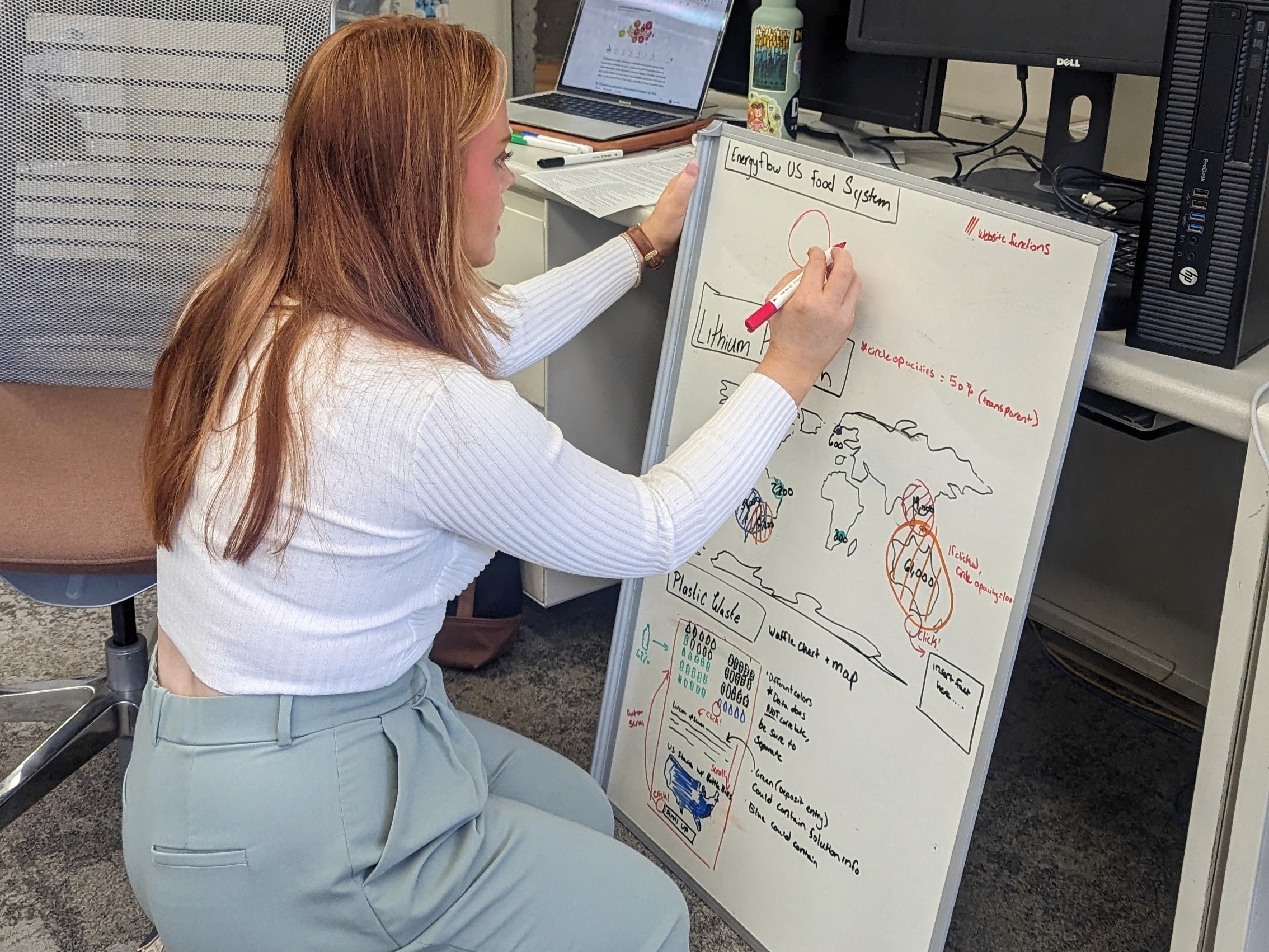
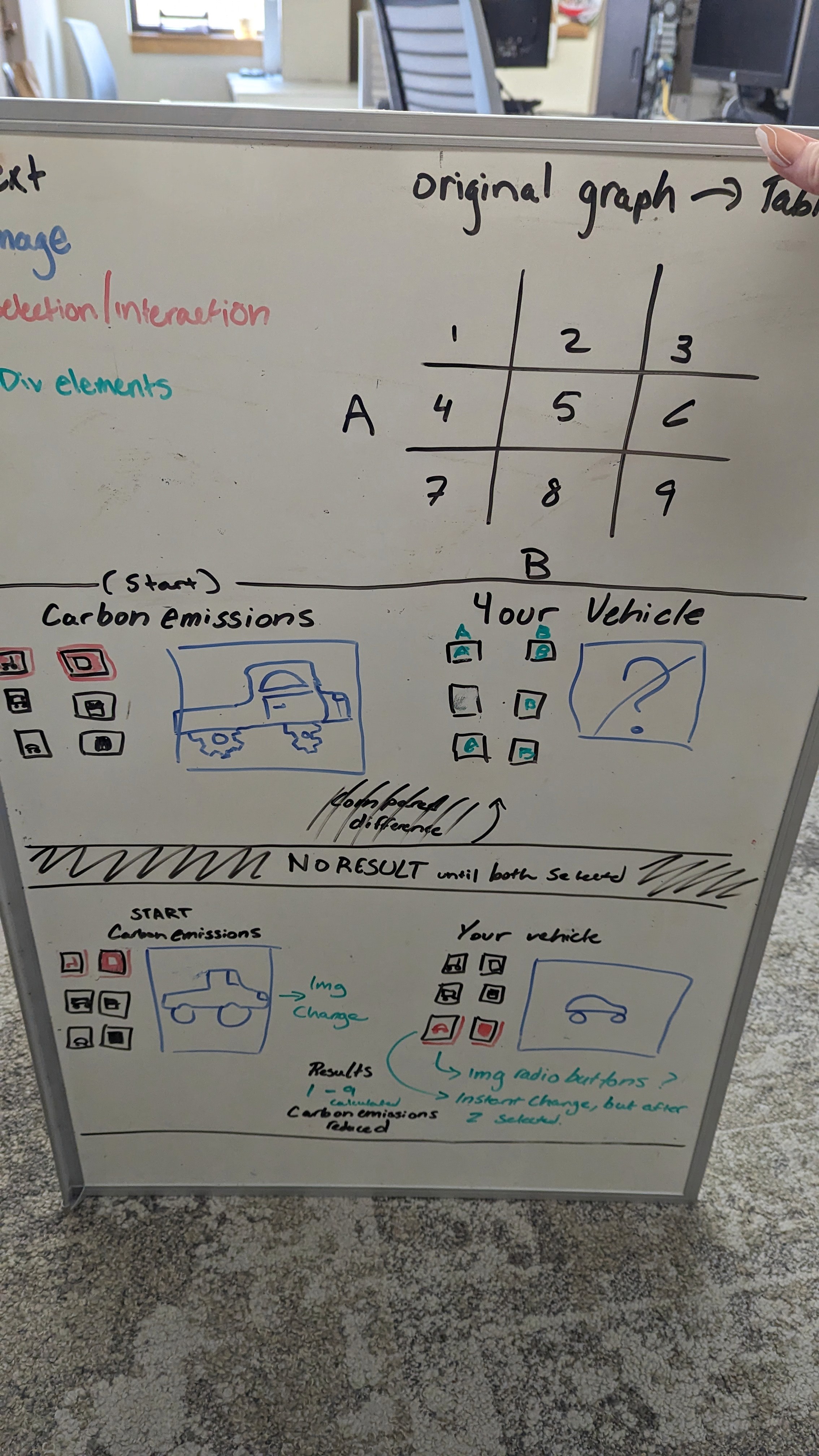
Development
Conducted 10+ Stakeholder Interviews
I spoke with faculty, communications staff, and researchers to understand what the audience needed, where users were landing from, and what insights they hoped to gain. This helped me understand the audience's journey.Designed with Intent
I leaned on principles from Storytelling with Data to make charts readable, engaging, and purposeful — avoiding pie charts and choosing layouts that emphasized clarity and comparison.Built for Accessibility
I advocated in my team to ensure every chart met basic accessibility standards, with high-contrast color palettes, keyboard navigability, and screen-reader-friendly descriptions where possible.This hands-on, iterative approach helped me move from uncertainty to impact — learning the right tools and questions along the way.
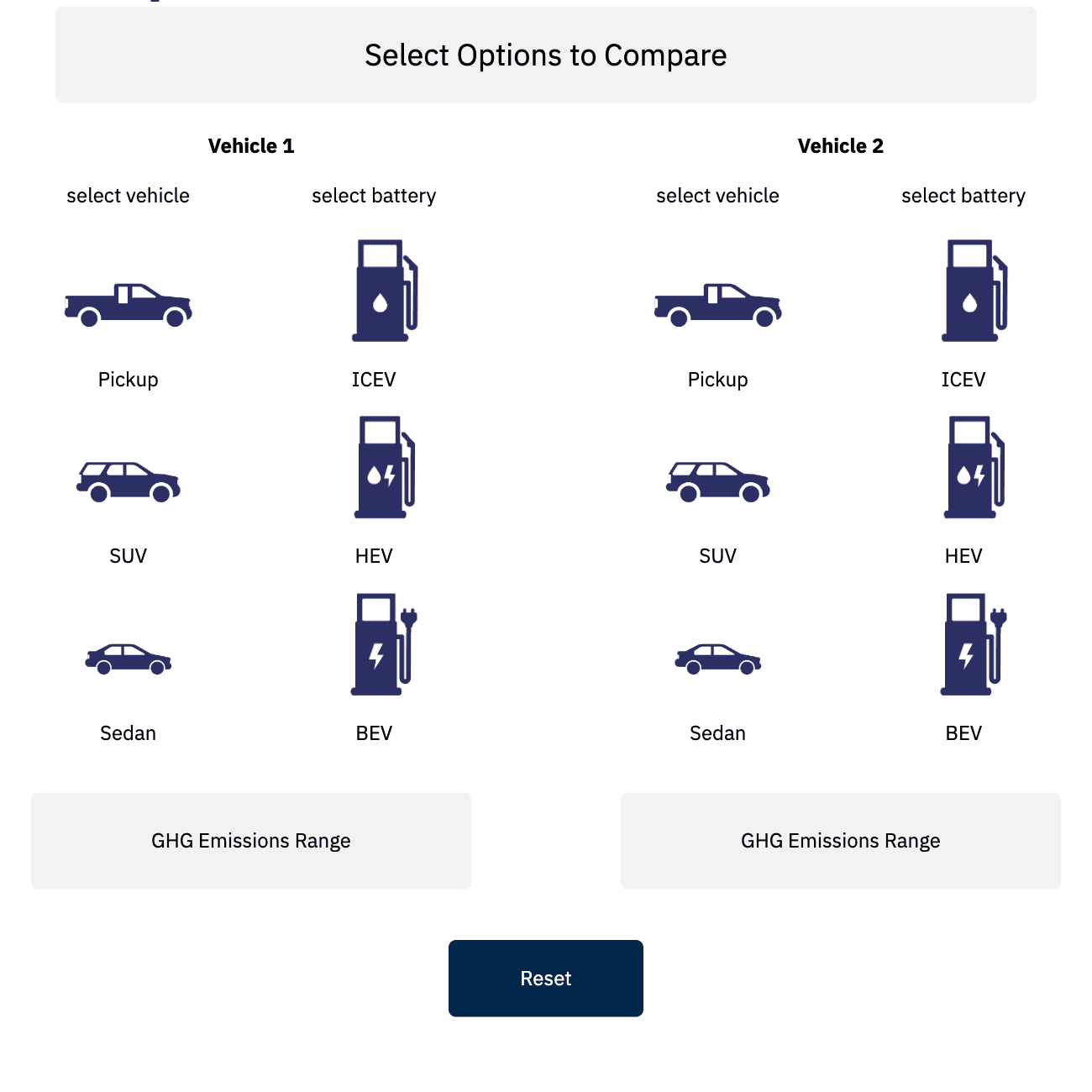
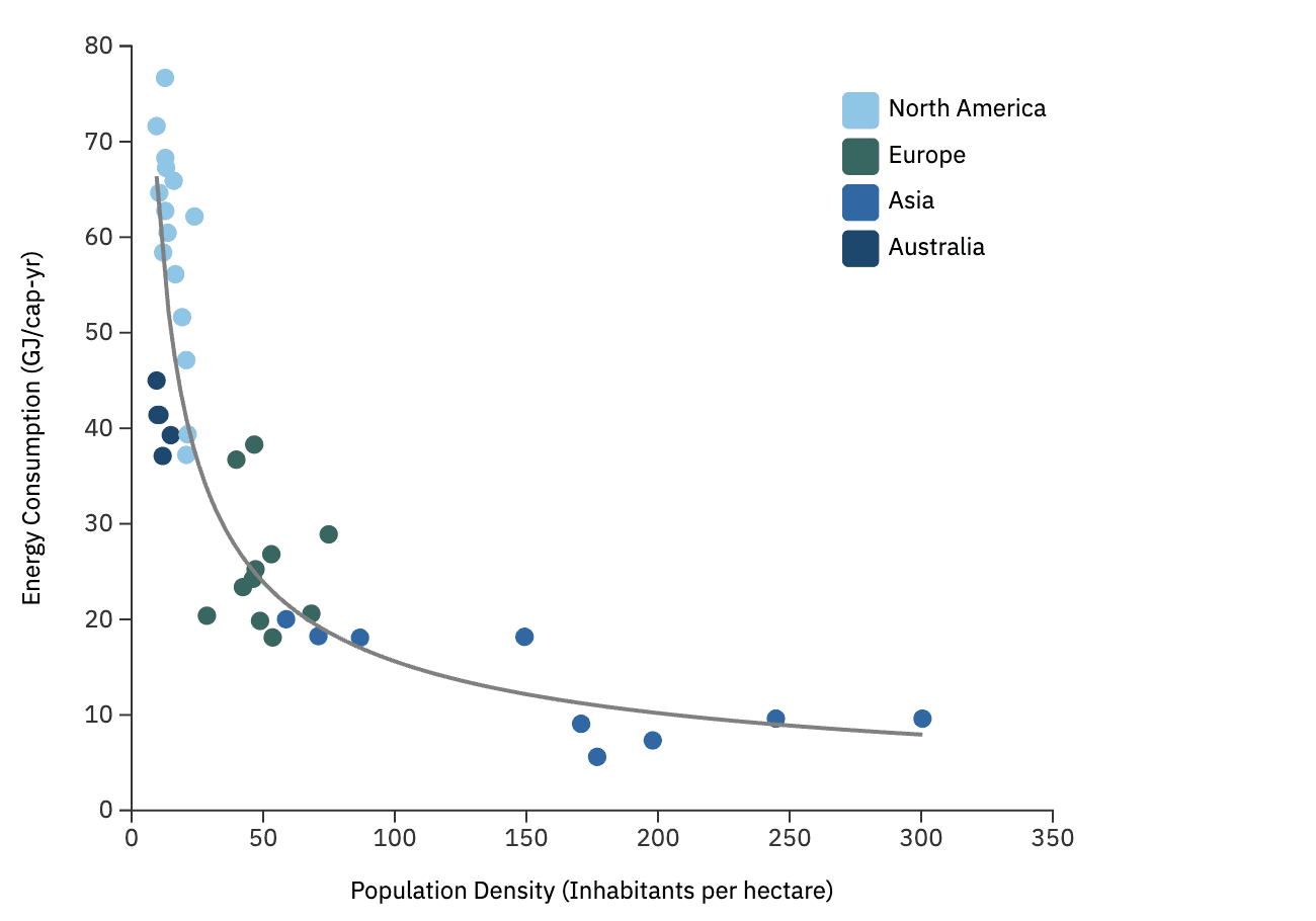
Deliver
40+ Interactive Charts
Embedded directly into the live Drupal site using JavaScript, HTML, and CSS. These visualizations allowed users to explore emissions, lifecycle assessments, and energy flows by toggling variables and hovering for insights.
20+ Infographics
Designed in Figma and Adobe Illustrator for social media, printed briefs, and slide decks. These static visuals aligned with CSS branding while clearly communicating environmental concepts.Custom Drupal Components
I worked directly in Drupal’s CMS to build reusable content blocks, clean up accessibility tags, and optimize layout structures for desktop and mobile.
Outcomes
Transformed decades of research interactive and navigable for thousands of site visitors annually.
Enabled k-12 and secondary educators to embed dynamic charts in classroom materials.
Contributed to the site’s 20% increase in engagement and visual clarity, cited during stakeholder reviews.
Helped evolve the visual identity of CSS through consistent, user-focused design.