Bridgestone FleetFix
Consolidated five fragmented fleet tools into one role-adaptive platform. Reducing task completion time by 75% and eliminating usability failures.
— First Place, UMSI 2025 Showcase
THE CHALLENGE
Five tools, one frustrated fleet manager.
Bridgestone's tire health ecosystem was fragmented across five separate platforms: Toolbox, Intellitire, Tyrata, Geotabs, and third-party telematics. Fleet managers couldn't get a unified view, alerts were overwhelming or missing, and every user role saw the same interface regardless of their needs. The result: increased downtime, safety risks, and avoidable operational costs.
THE SOLUTION
Introducing FleetFix one platform, every role
FleetFix consolidates five fragmented tools into a single, role-adaptive platform. The design prioritizes actionable data visualization, intuitive filtering, and a clear status hierarchy using red (critical), yellow (caution), and green (good) across every screen.
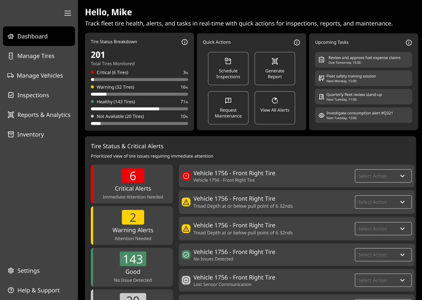 Dashboard screen
Dashboard
Role-aware KPIs, tire health at a glance, actionable alerts
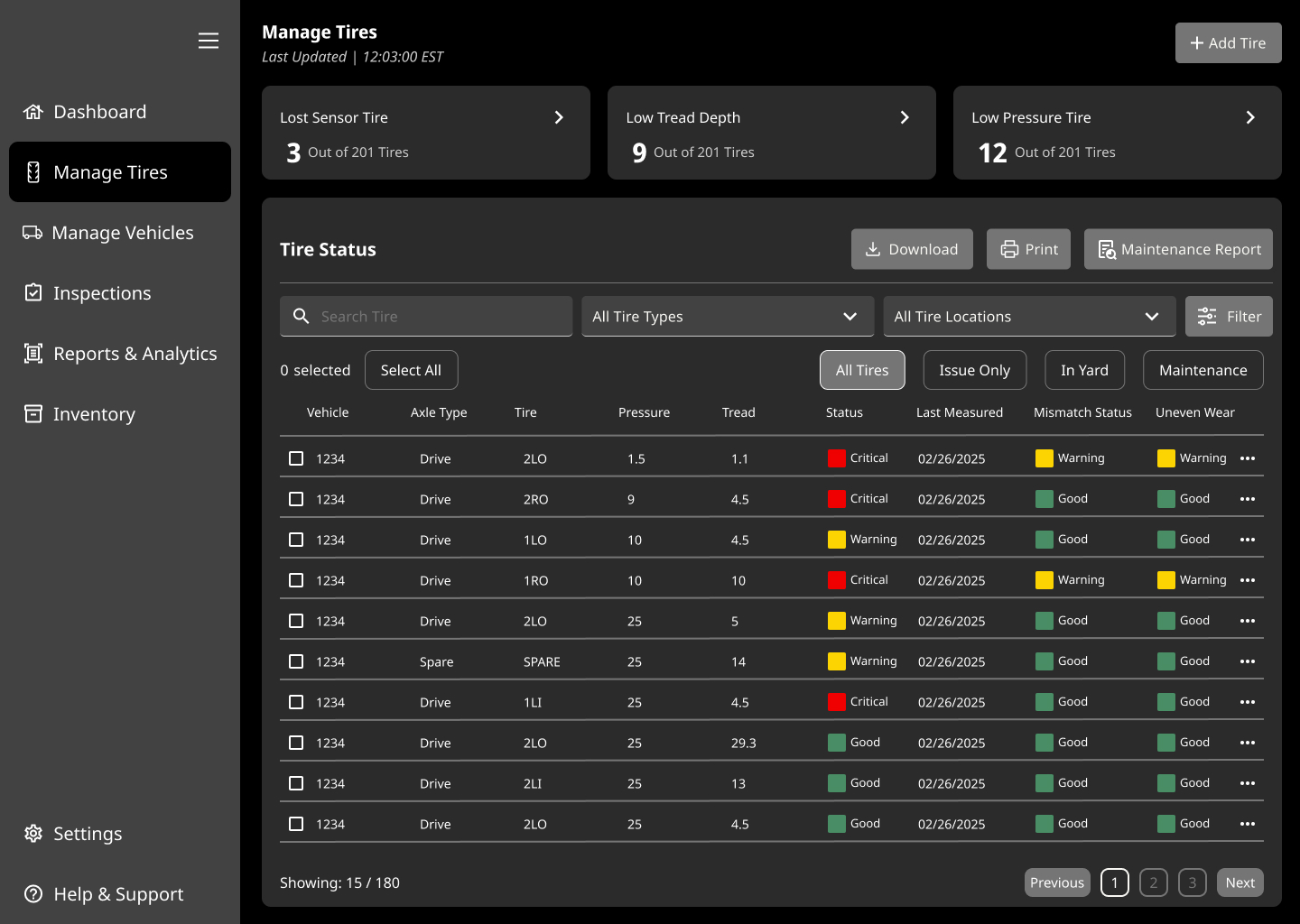 Manage Tires
Manage Tires
Filter and sort by status, location, vehicle, bulk actions
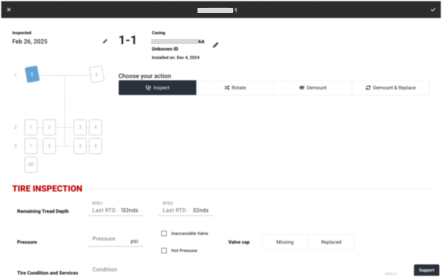
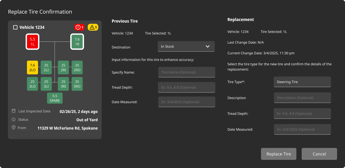 Change Tires
Change Tires
Step-by-step guided workflow for technicians in the field
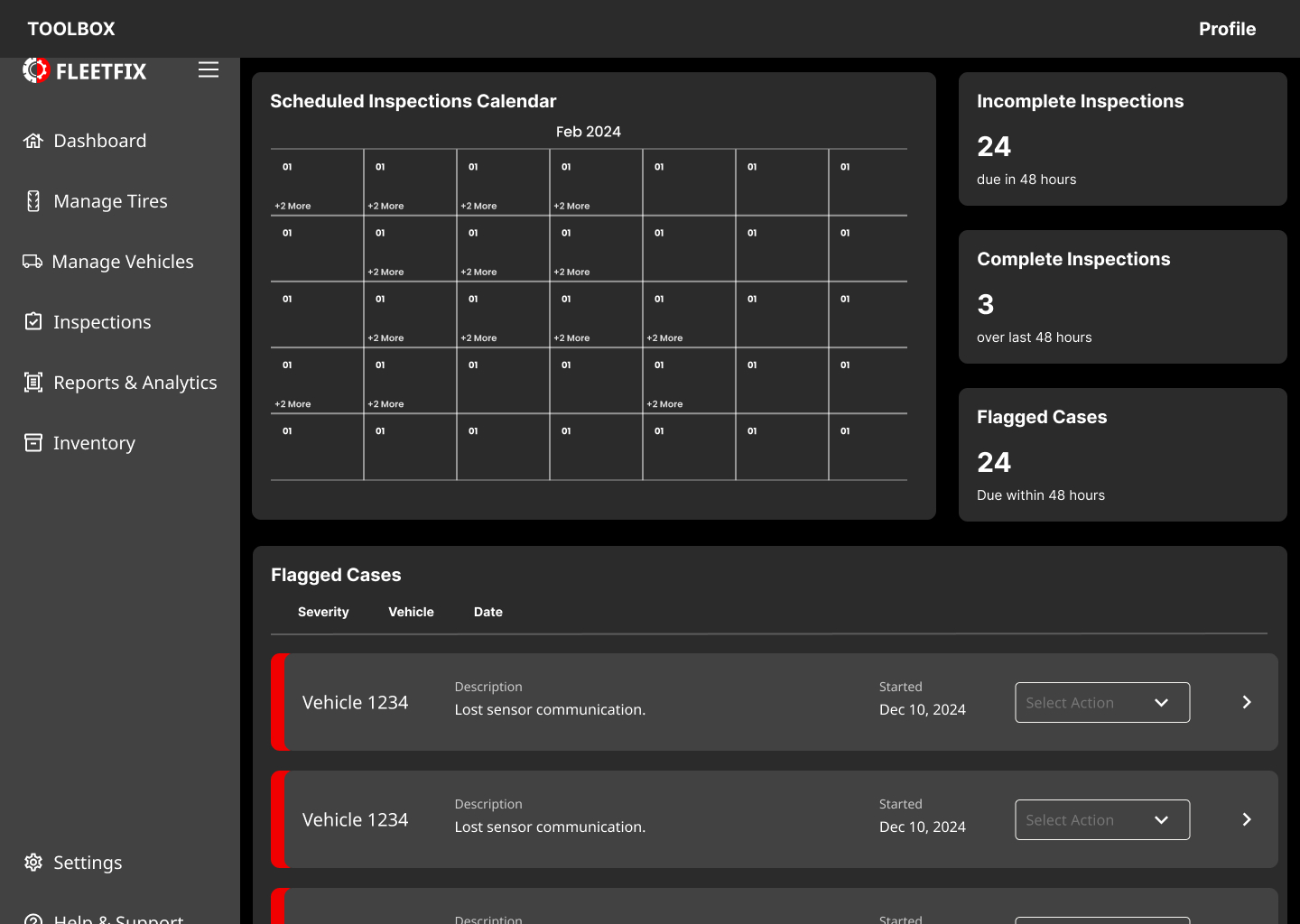 Inspections
Inspections
Weekly view with color-coded status and per-technician scheduling
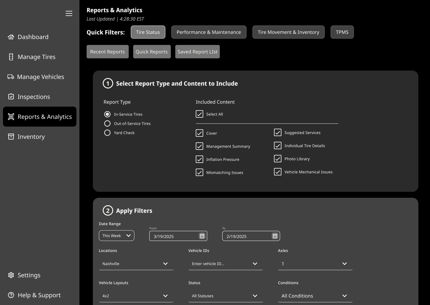 Reports
Reports
Custom report builder with exportable fleet health analytics
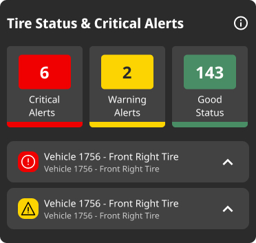 Alerts
Alerts & Notifications
Priority-ranked notifications with clear severity and one-tap actions
KEY DECISIONS
Why I chose this, not that.
Every design decision was driven by direct user feedback from fleet managers and technicians.
01
Health Score → Status Breakdown
Users found the original health score confusing and arbitrary. I replaced it with a clear percentage breakdown by tire status using consistent color coding throughout.
Before
 Before: confusing health score
After
After: clear status breakdown02
Monthly Calendar → Weekly Inspections
Fleet managers deal with rapidly changing daily issues. I made weekly the default with color-coded status indicators and per-technician scheduling.
03
Checkboxes → Distinct Calls to Action
Checkboxes on tire alerts were an unclear call to action. I replaced them with explicit 'Select Response' buttons, making the intended action clear.
THE IMPACT
7.5s
Avg task completion
75%
Error rate reduction
90%
Workflow efficiency ↑
70+
A11y fixes pre-handoff
0
Failed usability tests
"This platform understands how Bridgestone systems are connected. I like how it makes it easy for me."
— Bridgestone User
WHAT I LEARNED
Managing a team of five across a seven-month capstone with a Fortune 500 client taught me when to push for more and when to ship. Our initial health score tested poorly — instead of defending it, we listened and rebuilt it. That willingness to kill a feature that looks good on paper but fails in practice is something I carry into every project now.
SEE THE FULL FILE
Browse every screen and the full component library in Figma.
OPEN IN FIGMA ↗Password: bridgestone