As part of the University of Michigan’s Transportation Research Institute (UMTRI), I joined a research team focused on improving the usability and safety of modern infotainment systems found in cars. These digital dashboards are a key component of how users interact with their vehicles — for navigation, media, phone calls, and more — yet they often introduce cognitive load, visual clutter, and accessibility barriers. My task was to investigate what makes infotainment systems usable (or not), by conducting a deep dive into current platforms, synthesizing academic research, and beginning to outline a better, driver-centered experience.
Role:
UX Research Lead
Industry:
Automotive
Duration:
May – Aug 2025
Discovery
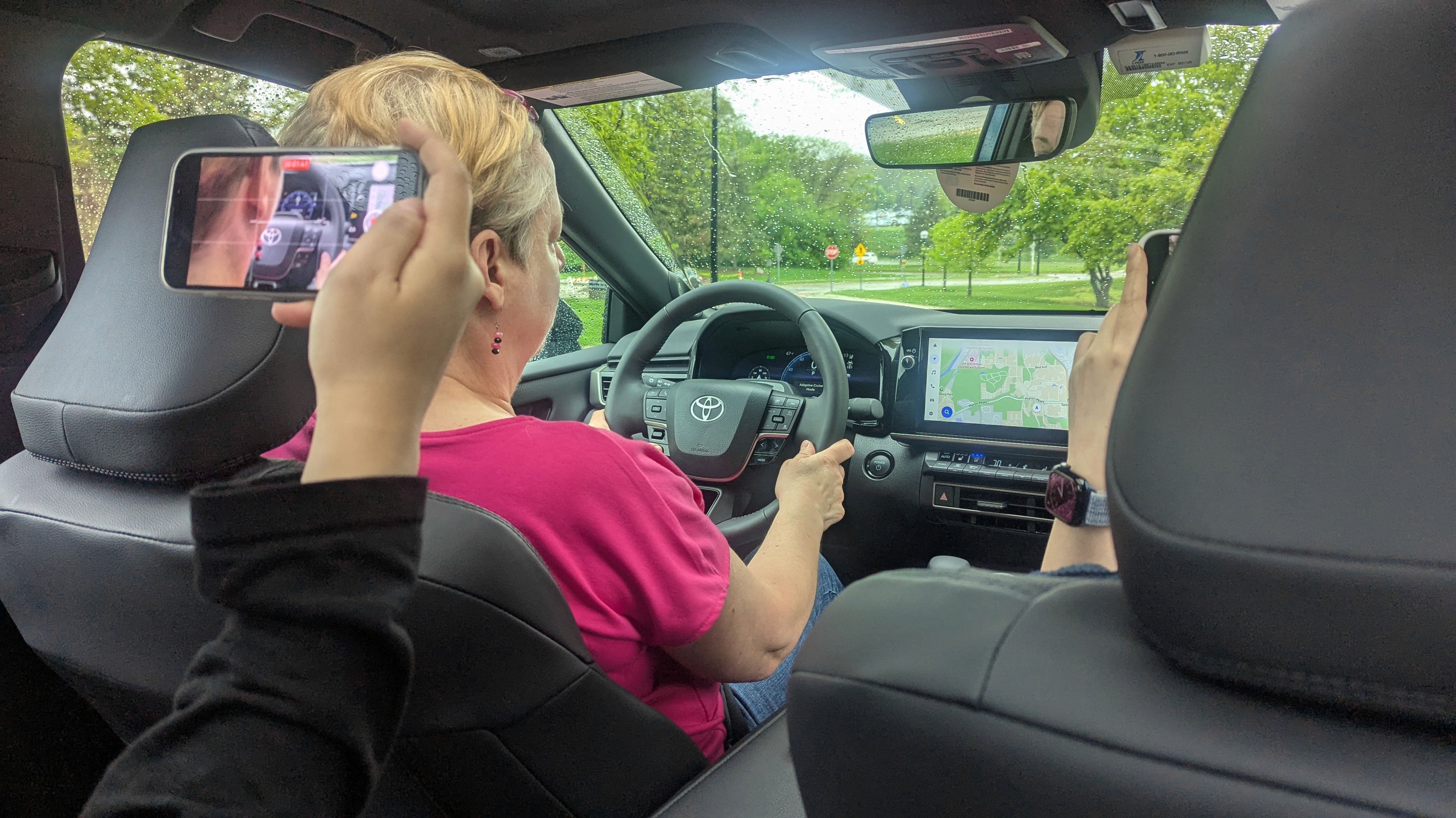
Conducted heuristic evaluations on Android Auto, Apple CarPlay, and multiple UI infotainment screens (models 2025-2026.) Developed a 15-page document of all infotainment-related specifications for UX requirements.
Referenced 40+ academic articles, UX laws, and ISO safety standards to identify recurring usability problems
Compared against SUS scores and real-world constraints of driver safety and glanceability
Define
To guide the definition phase, I produced a detailed Infotainment Requirements Report, synthesizing findings from academic research, regulatory guidelines, and real-world evaluations. This document included:
Heuristic Mapping: Each system was analyzed against Nielsen’s 10 Usability Heuristics, the Laws of UX, and ISO safety guidance.
Visual and Interaction Standards: Defined target sizes, feedback mechanisms, visual hierarchy, and layout constraints relevant to drivers.
Accessibility Benchmarks: Applied WCAG standards to evaluate readability, contrast, and screen-reader compatibility.
Cognitive Load Analysis: Applied Hick’s Law and the Doherty Threshold to define ideal menu depth, grouping, and decision points.
Example of standards produced within the report:
System | Avg. SUS Score | Key Violations |
|---|---|---|
Android Auto | 63.5 | Touchpoint size, contrast, hierarchy |
Ford Sync | 72.0 | Menu nesting, icon meaning |
Toyota Native UI | 59.8 | Layout inconsistency, poor affordances |
This report became a foundation for identifying and prioritizing improvements across IVI systems — shaping design goals not just for usability, but for safer, more accessible on-road experiences.
Identified top UX violations including:
Small touch targets (Fitts’s Law)
Layout inconsistencies (Jakob’s Law)
Overloaded menus (Hick’s Law)
Low contrast + unclear hierarchy (WCAG)
Missing feedback or unclear system states (Nielsen’s #1)
Mapped insights into user-centered design priorities for future infotainment systems
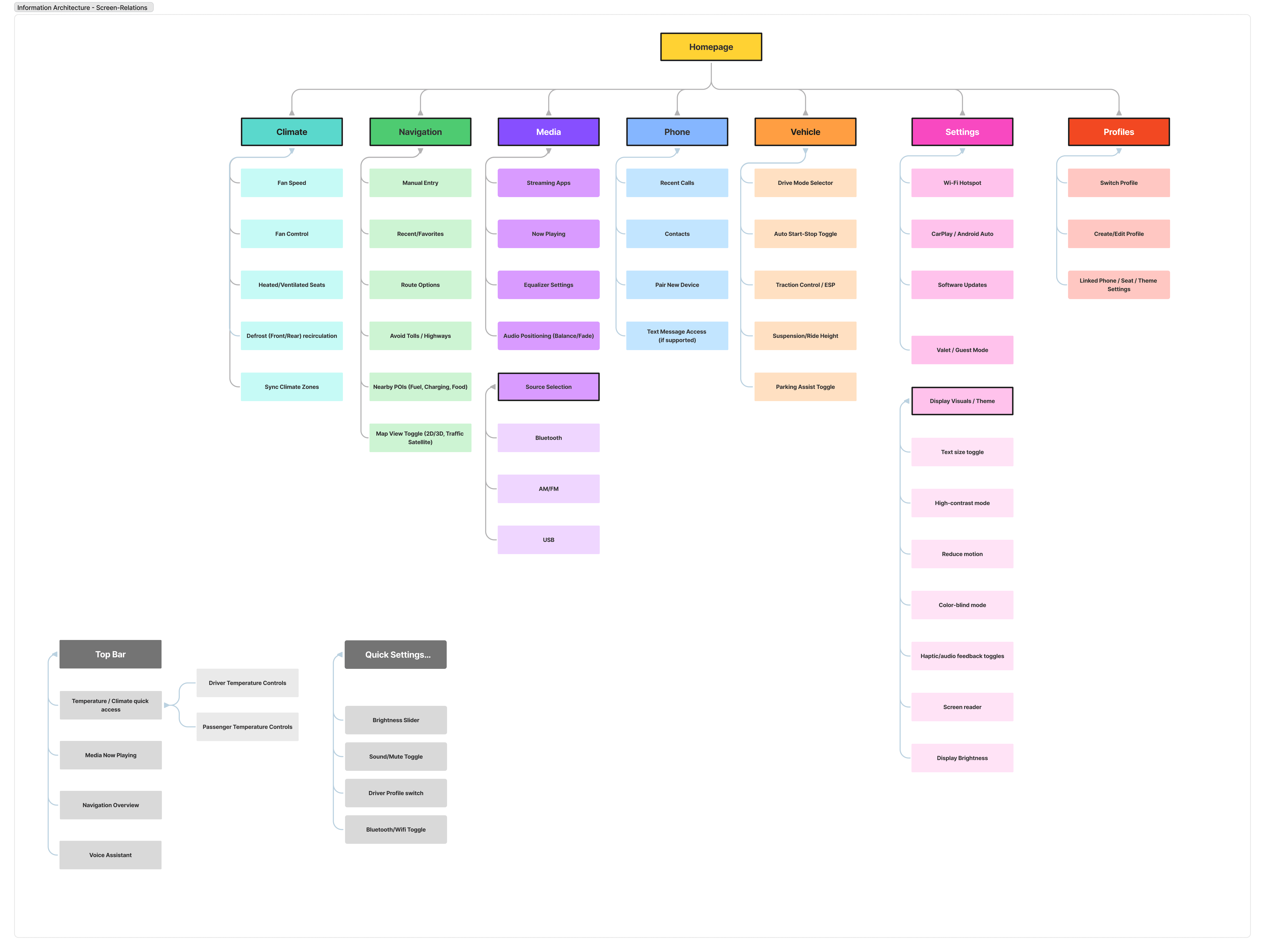
Developed information architecture to produce guidelines of infotainment hierarchy, especially fitting with NCAP 2026 Standards.
Development
I am now transitioning into the Develop phase, creating an interactive infotainment prototype rooted in the insights gathered earlier. The design integrates:
Simplified layout and visual structure (Law of Prägnanz)
Progressive Disclosure to reduce on-screen decision fatigue
Color contrast and redundant iconography to meet WCAG accessibility standards
Driver-centric features, like glanceable info, minimal touch interaction, and streamlined navigation tasks
The goal is to produce a usable design aligned with real-world safety constraints, supported by UX heuristics and empirical research.
Deliver
In Progress